
[vc_row row_type=”row” use_row_as_full_screen_section=”no” type=”full_width” angled_section=”no” text_align=”left” background_image_as_pattern=”without_pattern” css_animation=”” css=”.vc_custom_1456152983869{padding-bottom: 10px !important;}”][vc_column][vc_column_text]
NOVA
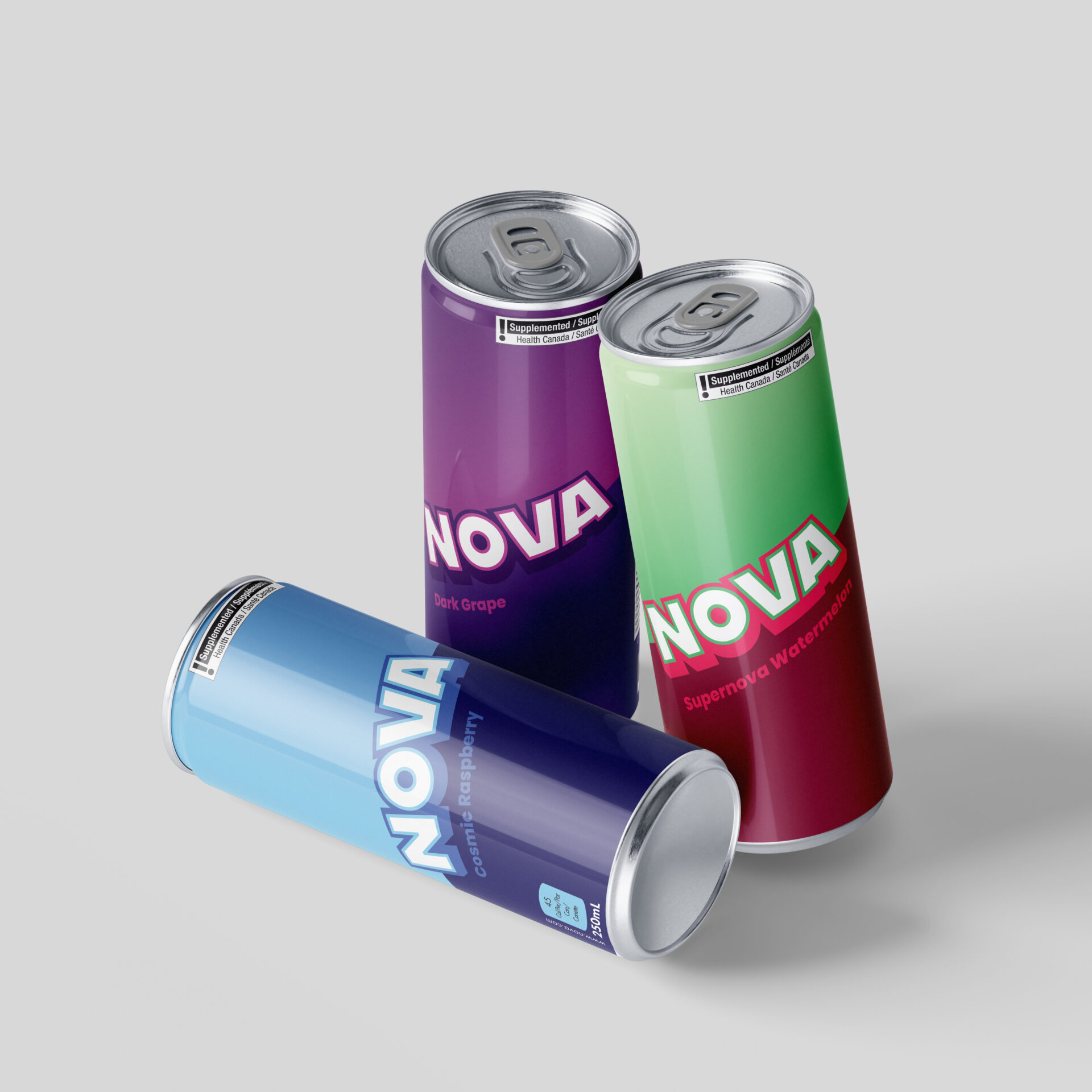
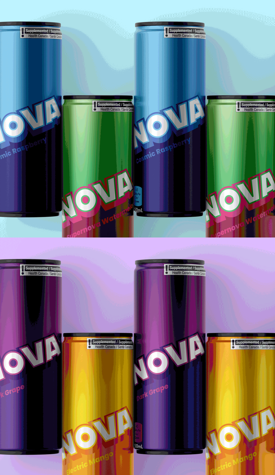
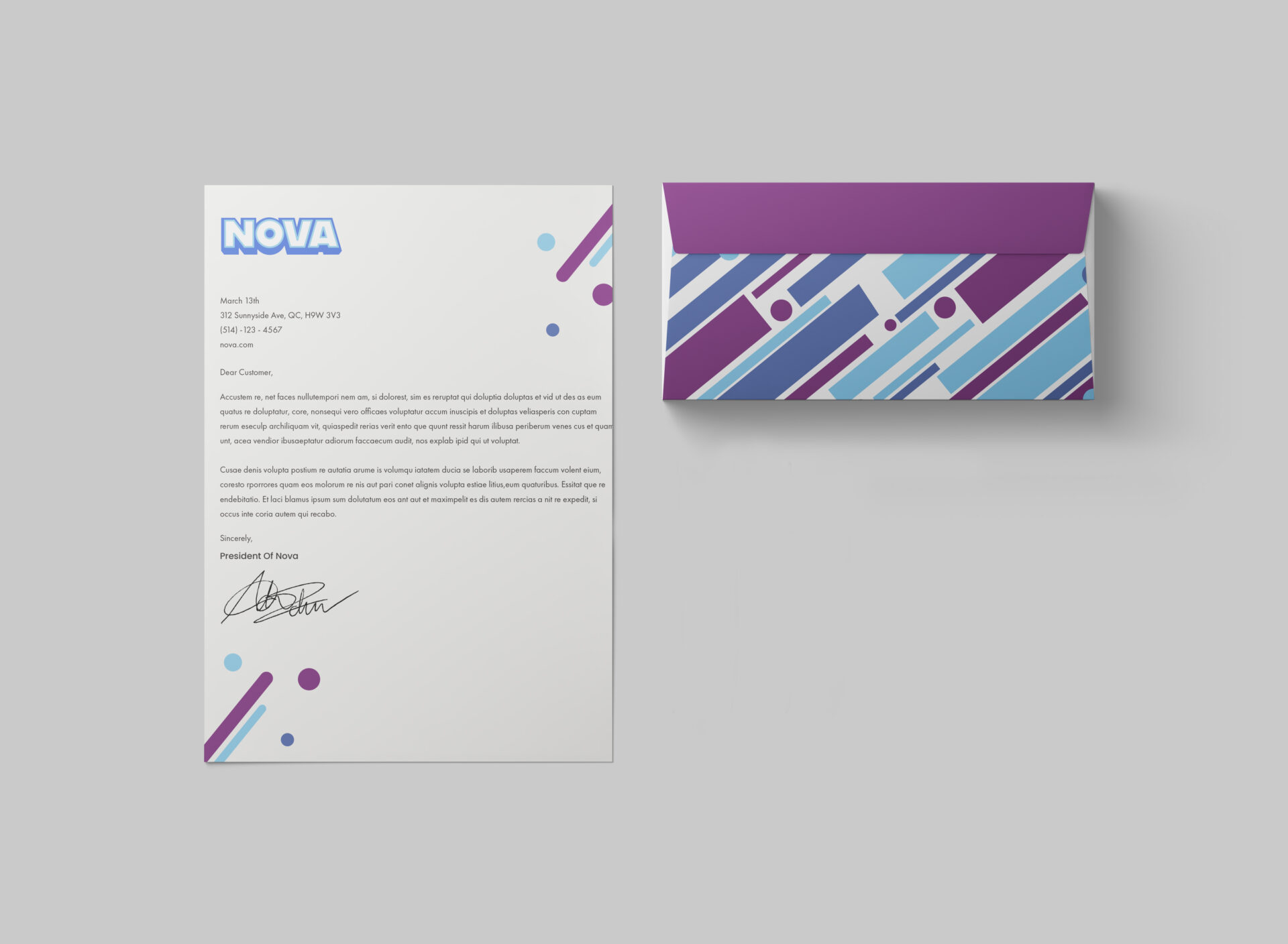
[/vc_column_text][vc_separator type=”transparent” thickness=”0″ up=”30″ down=”0″][vc_column_text]The NOVA brand was a lot of fun to create. It took a lot of time and discussion with my cohorts to figure out the logo, but in the end, we settled on a bold and eye-catching typography and used a lot of different colours to pull people in. The cans were the same thing. We originally wanted to go with more illustrations, but we settled for bold and powerful, which I find we captured very well in our design. [/vc_column_text][vc_separator type=”transparent” thickness=”0″ up=”37″ down=”0″]VISIT WEBSITE[/vc_column][/vc_row]
Date
February 22, 2016